Lowell Arts
A brand identity refresh for Lowell Arts, focused on reflecting the organization’s growth and evolving role within the creative community. This project established a new visual direction that honors the non-profit’s history while giving the organization a more contemporary look for the future.

Creative Directions
We explored three distinct concepts, each offering a different approach to evolving the Lowell Arts identity. The Building Community direction was selected for further development, with continued refinements to create a cohesive visual identity reflecting the organization’s values and vision.
Elevating Interactions
Building Community
Forming Connections
Developing the Identity
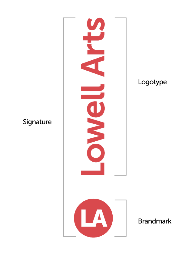
The signature mark uses a vertical orientation to symbolize growth and the organization’s continued evolution. Its unique placement creates a recognizable visual element that sets the identity apart while offering flexibility across different brand applications.
Typography
H1Museo Slab 700
Fallasburg Arts Festival
H2Museo Slab 500
Celebrating 50 years
H3Museo Slab 300
Lowell Arts connects artists and audiences through visual and performing arts
H4Museo Sans 700
Single Session: Thursday, November 29, 2023
PMuseo Sans 300
Lowell Arts is accessible to all visitors whatever their ability. Visitors to our facility can expect a ramped entrance near handicapped parking spots.
Visual language
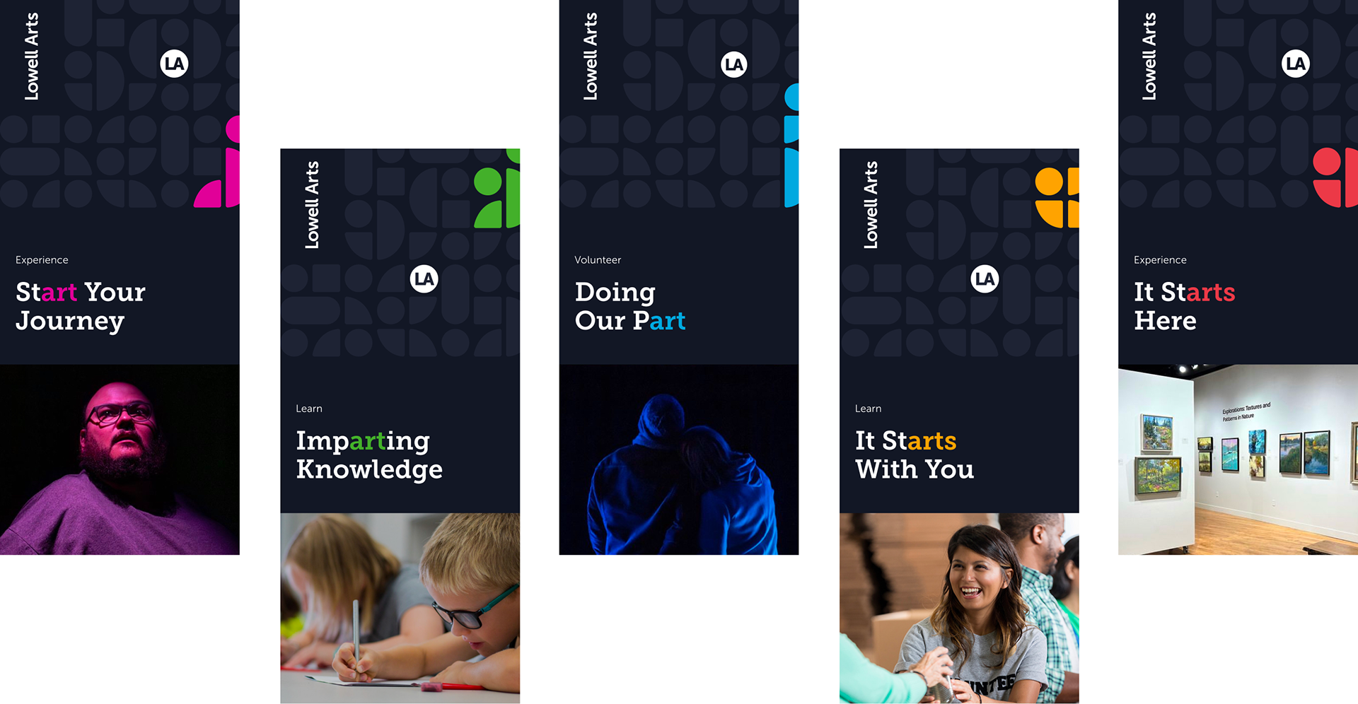
Experience
Represents the individual observing or watching.
Lowell Arts
Represents an experienced artist or a beginner just starting out.
Volunteer
Represents a volunteer individual standing and being actively involved.
Learn
Represents any age learning individual, whether young or old.
Give
Represents donation and giving between individuals and the organization.
Color palette
Lowell Red
Pantone: Red 032 C
Hex: #EF3340
CMYK: 0/79/73/6Pattern Red
Pantone: 199 C
Hex: #D63644
CMYK: 0/75/68/16Cool Black
Pantone: 296 C
Hex: #121725
CMYK: 51/38/0/85Pattern Gray
Hex: #1E2334
CMYK: 42/33/0/80Lowell Gray
Pantone: Cool Gray 3C
Hex: #EAE8E5
CMYK: 8/5/6/13Experience Pink
Pantone: 2385 C
Hex: #E10098
CMYK: 0/100/32/12Learn Green
Pantone: 361 C
Hex: #39B54A
CMYK: 75/0/100/0Volunteer Blue
Pantone: 2995 C
Hex: #00B3EF
CMYK: 87/1/0/0Give Yellow
Pantone: 137 C
Hex: #FFA300
CMYK: 0/20/92/0
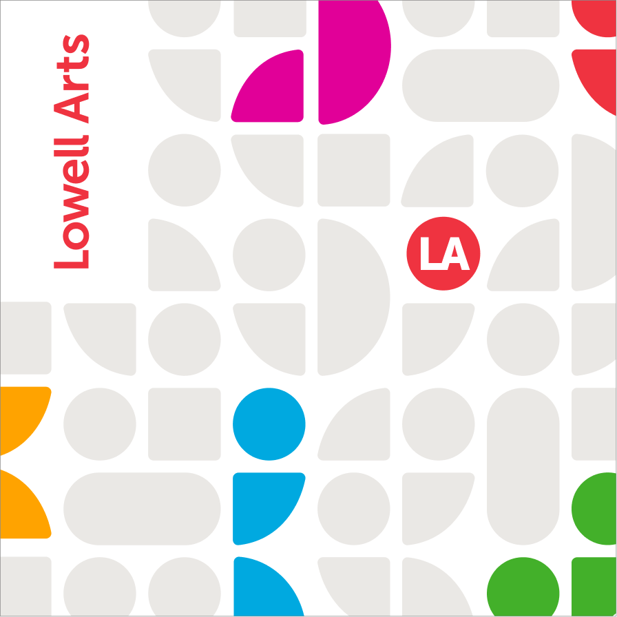
Patterns


Signage and Storefront
The refreshed identity was extended to the building’s exterior through updated storefront signage and window graphics. These concepts explored how the new branding would be incorporated into the existing architecture.


Artist Market Photography
Our team also developed the creative direction for a photography shoot featuring artwork and materials from the Artist Market. The compositions were arranged with social media graphics in mind, leaving space for accompanying text while highlighting the variety of work featured at the event.


Events and Merchandise
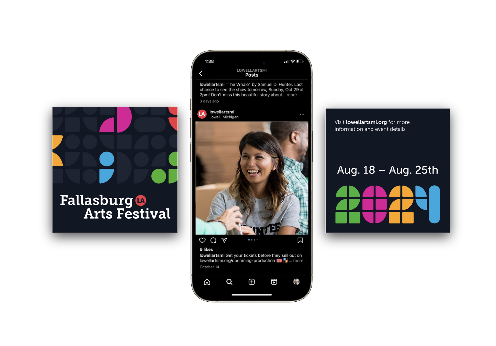
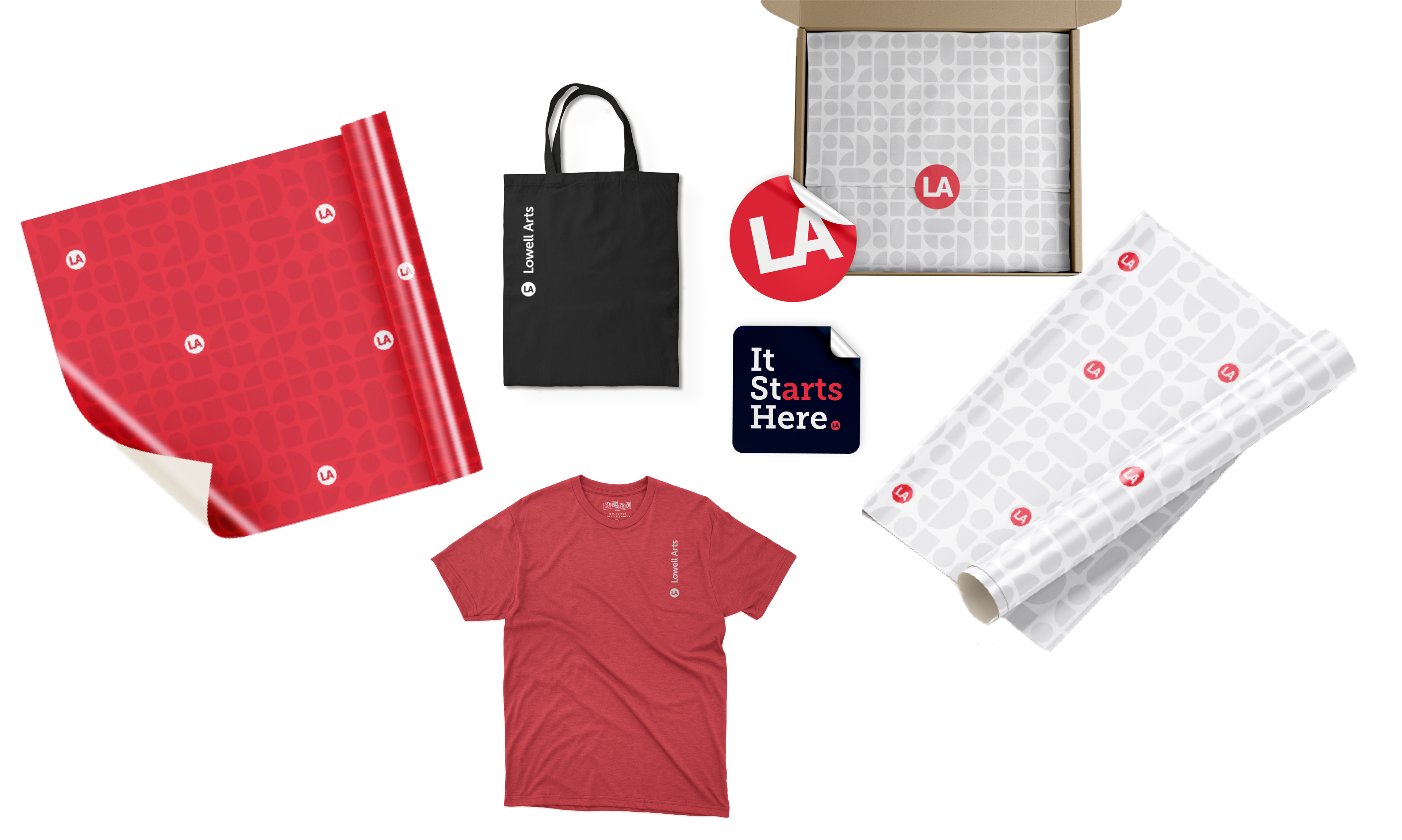
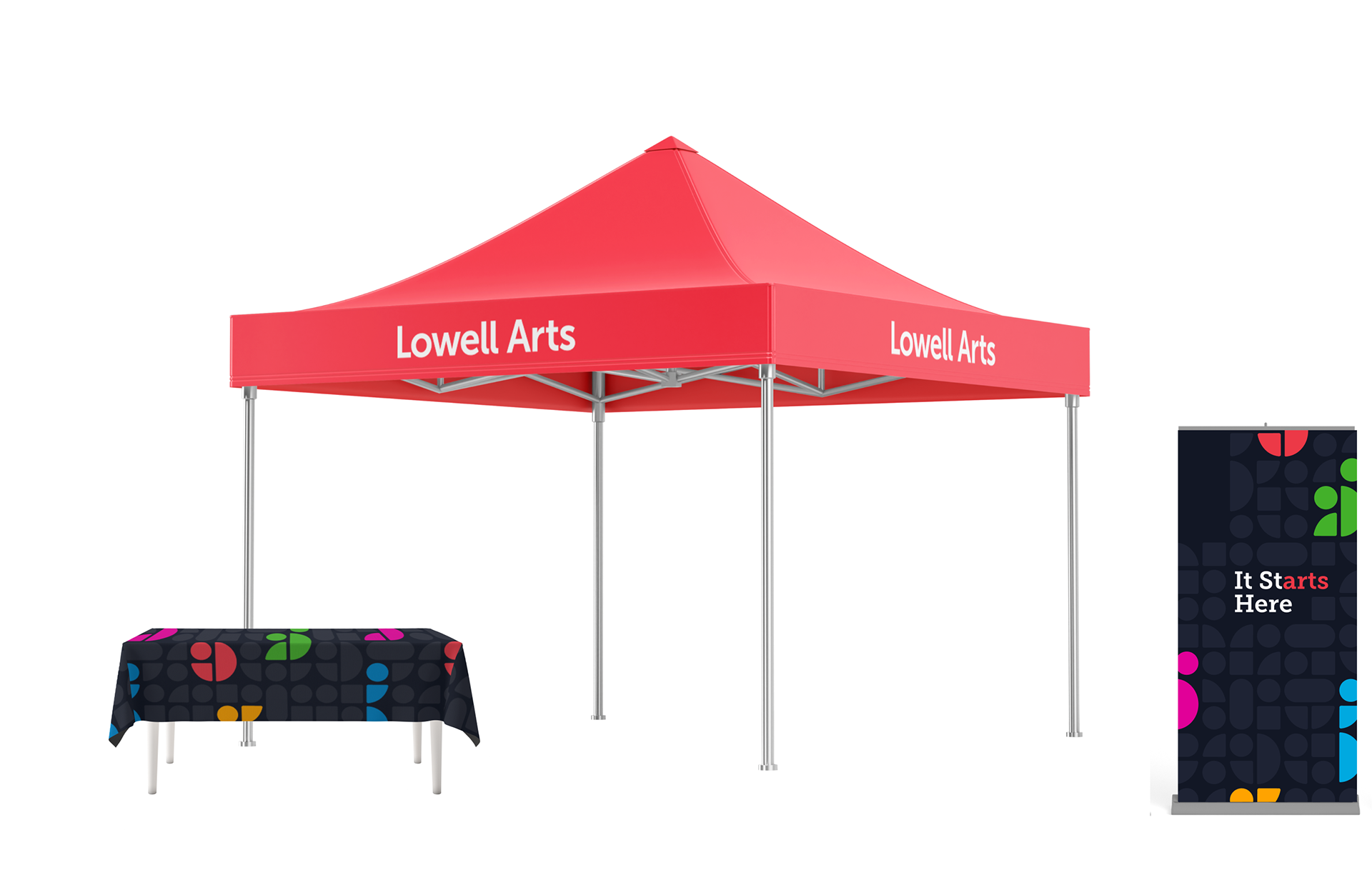
The signature pattern and supporting marks were incorporated into everything from event tents to branded accessories, creating a recognizable presence both within the community and at Lowell Arts events.
Bringing it All Together
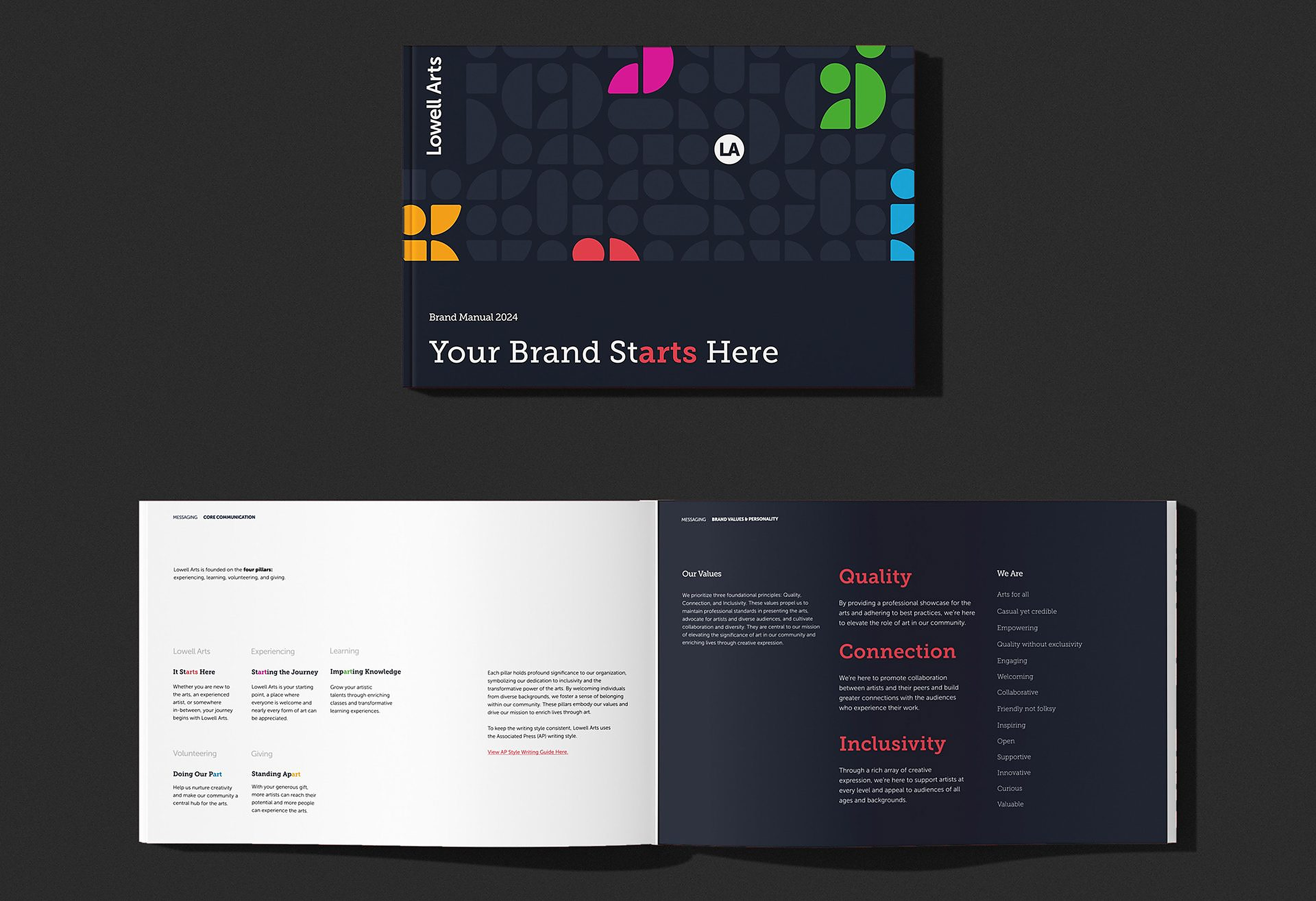
The brand manual brings the identity together in one place, outlining guidelines for the logo, color palette, and typography. It also explores supporting marks and patterns, along with additional brand touchpoints that show how the identity is applied across different mediums. Check out the full manual below or read more about the rebrand covered throughout Lowell's First Look!