Scramble
A conceptual branding project for a breakfast bowl restaurant focused on making healthy breakfast options more convenient. This project involved developing a distinct visual identity that reflects the restaurant’s character and establishes a consistent brand presence across applications.
Understanding Users
Initial UX research helped identify the target audience’s needs and expectations, while additional research highlighted the health benefits of eating breakfast regularly. These findings created an opportunity to position the brand around nutritious, convenient meals that encourage healthier morning routines. This direction helped shape the overall brand identity and how it would connect with customers.
Jackson
Regional Sales Manager · Chicago, IL
Empathy map
Thinks / Feels
- Breakfast is his favorite meal of the day
- Wishes he could get quality food quickly
Sees
- People often late to work, trouble leaving time for their morning meal
- Doesn't see a variety of current food options
Hears
- Others talking about their busy mornings + little time
- People desire new options to try on their way to work
Does
- Mixes up his current breakfast variety often
- Avoids places with slow service and limited options

Behind the Brand
The brand identity incorporates the shape of a breakfast bowl into its logo, creating a visual connection to the restaurant’s offerings. This concept extends throughout the design system, emphasizing convenience, simplicity, and efficiency through three key steps: order, grab, go.
Typography
Scramble
The quick brown fox jumps over the lazy dog.
Color palette
Charcoal
#2A2A2A
Orange
#FA5A16
Teal
#0BC3CC
Yellow
#FFDE01
White
#FFFFFF
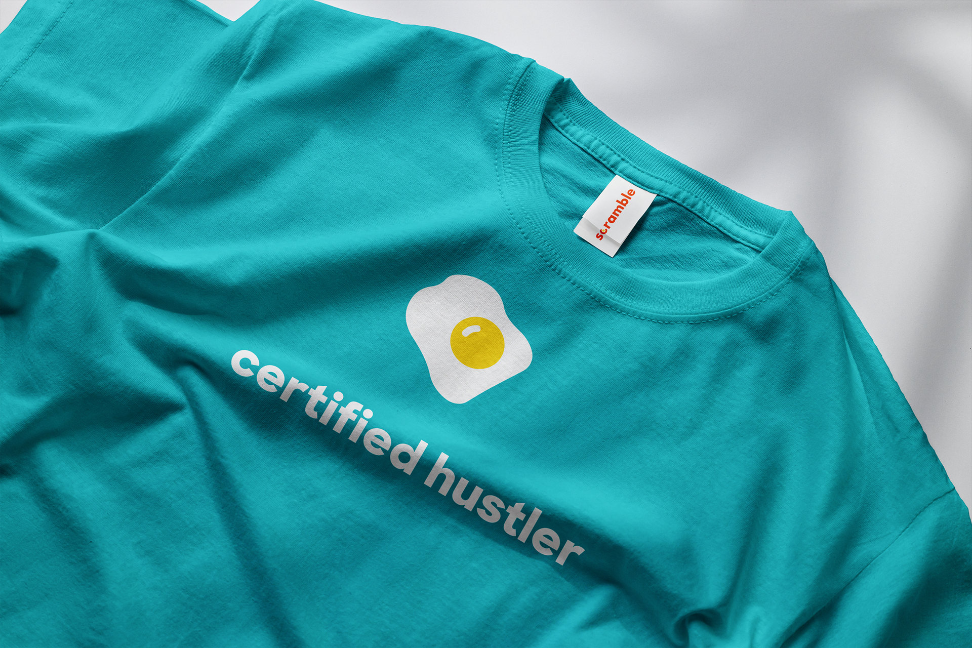
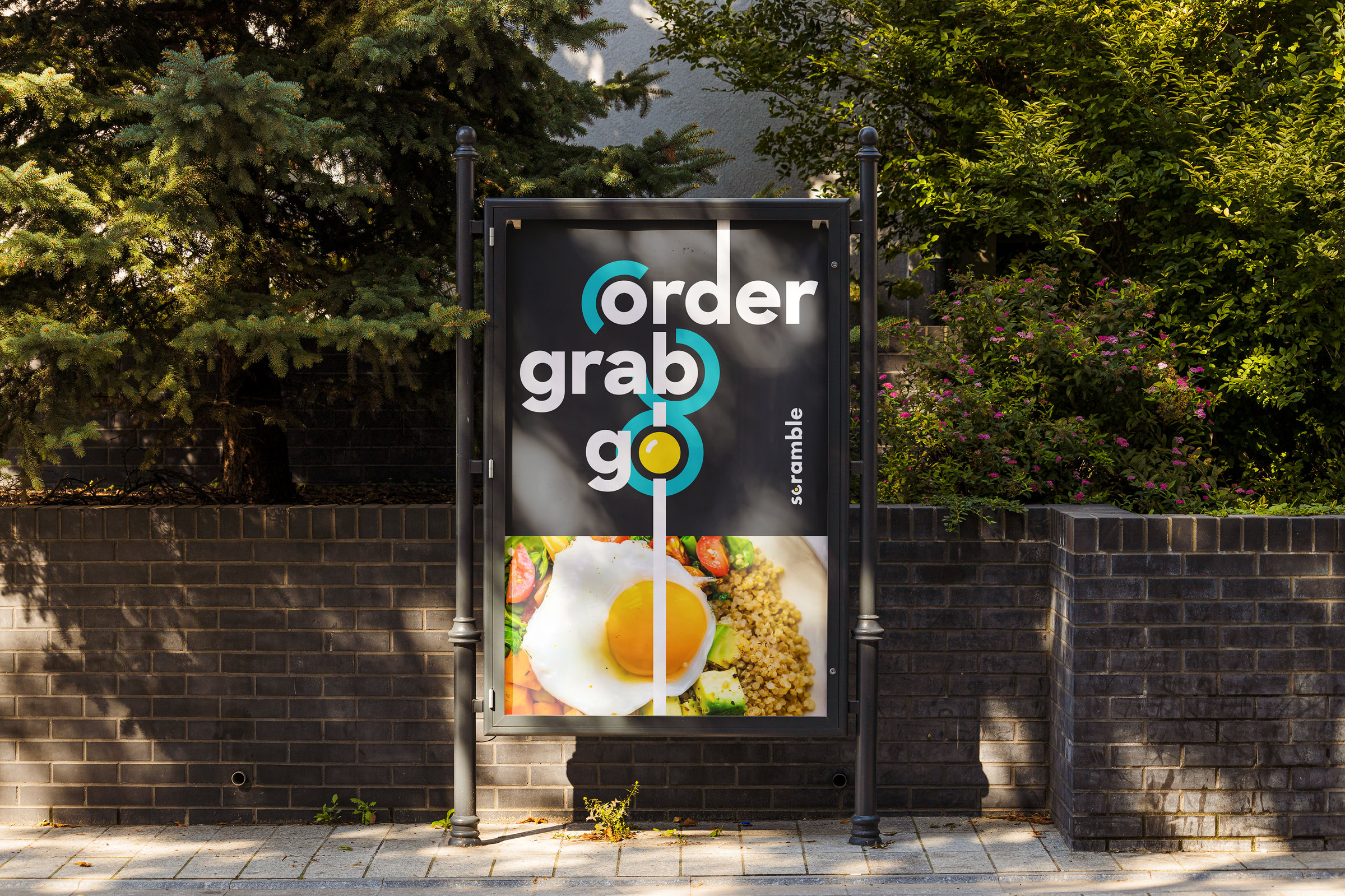
Making an Impression
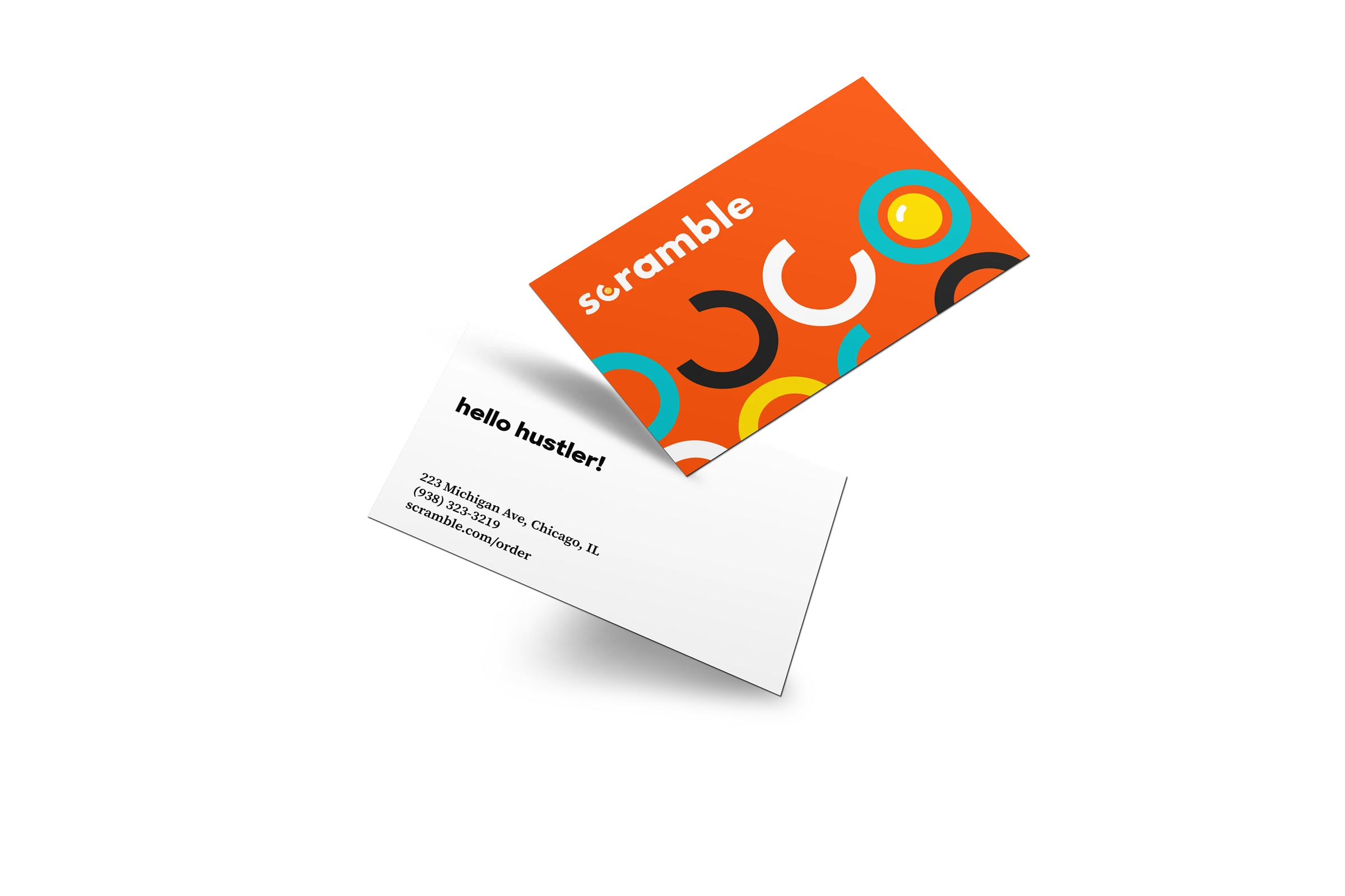
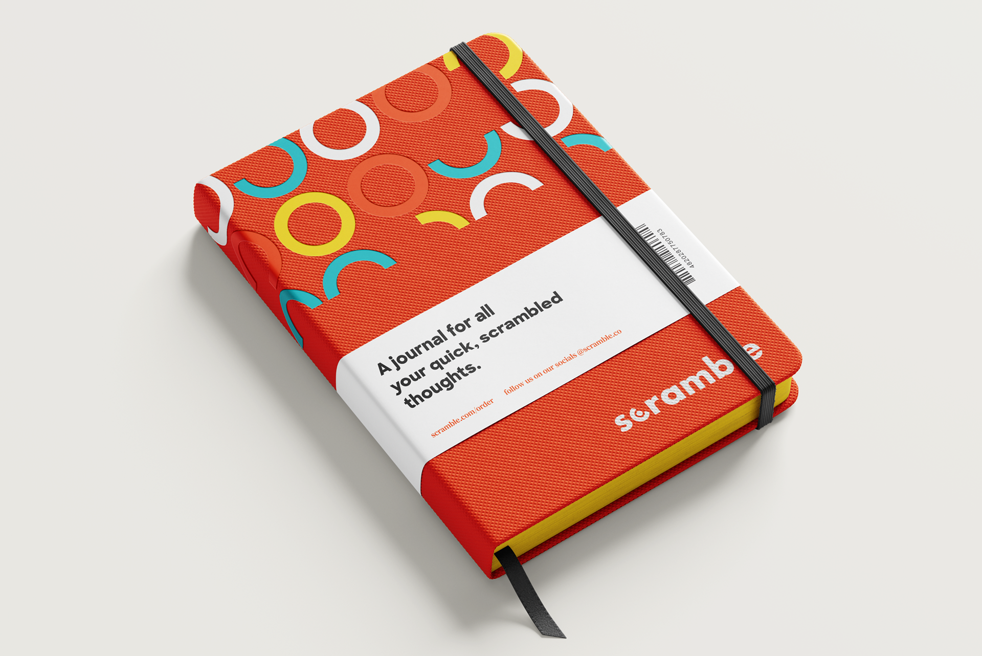
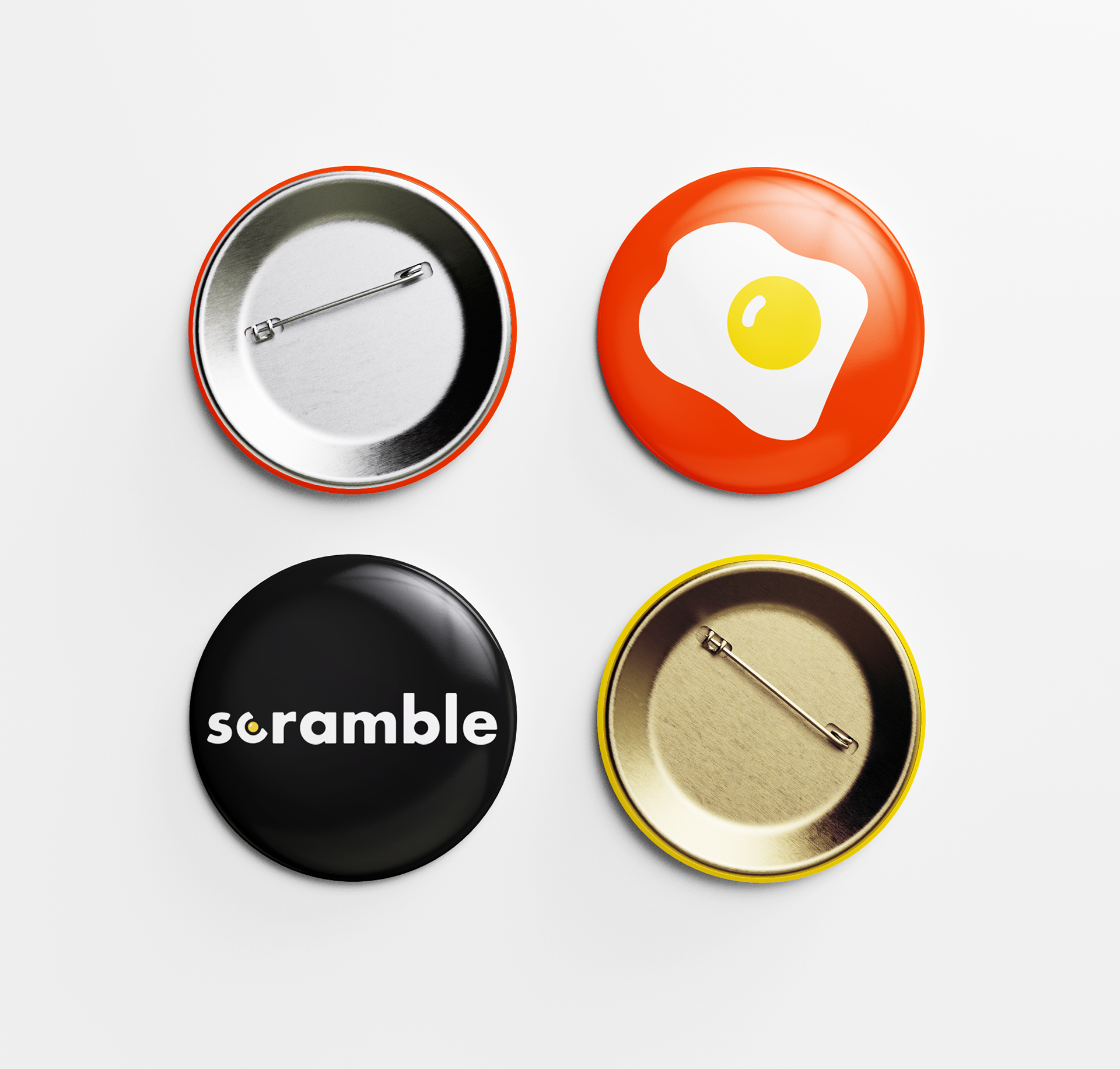
The visual identity extends beyond the logo through a variety of branded materials. Each piece uses elements of the brand to bring its personality to life while maintaining a consistent look across different applications.