Stock Market Media
This project involved contributing to brand identity development and visual design across a network of financial media brands. My work extended into UX/UI and front-end development, including responsive page layouts and website enhancements. Through custom theme development and improvements to existing functionality, I helped maintain each brand’s distinct identity across its digital platforms.


Goals & Objectives
Establish and evolve distinct brand identities while maintaining consistency across existing properties. Enhance digital experiences through thoughtful UX improvements, accessible and responsive design, and ongoing development efforts that improve usability, functionality, and overall site performance.
Branded Property Identities
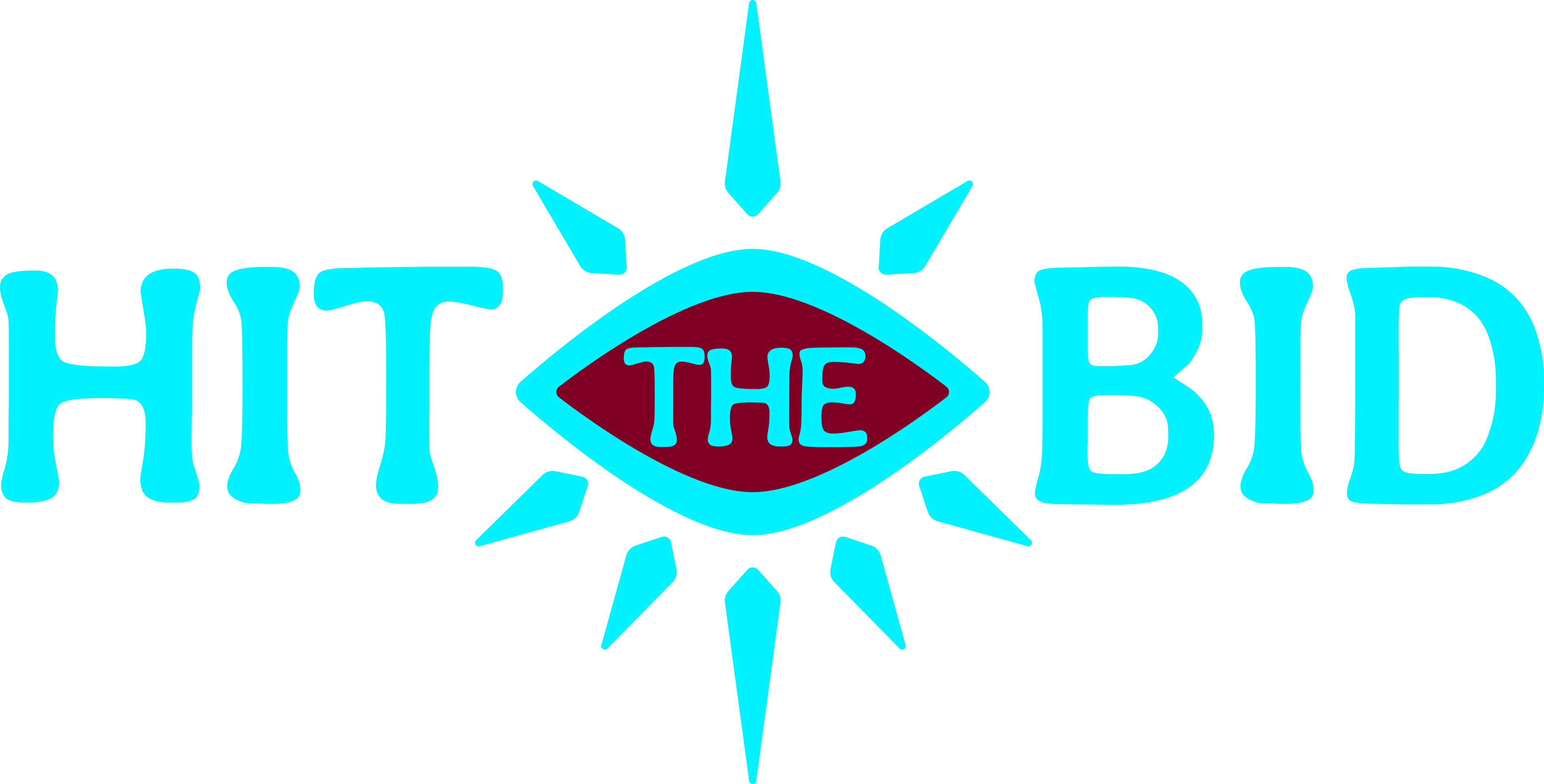
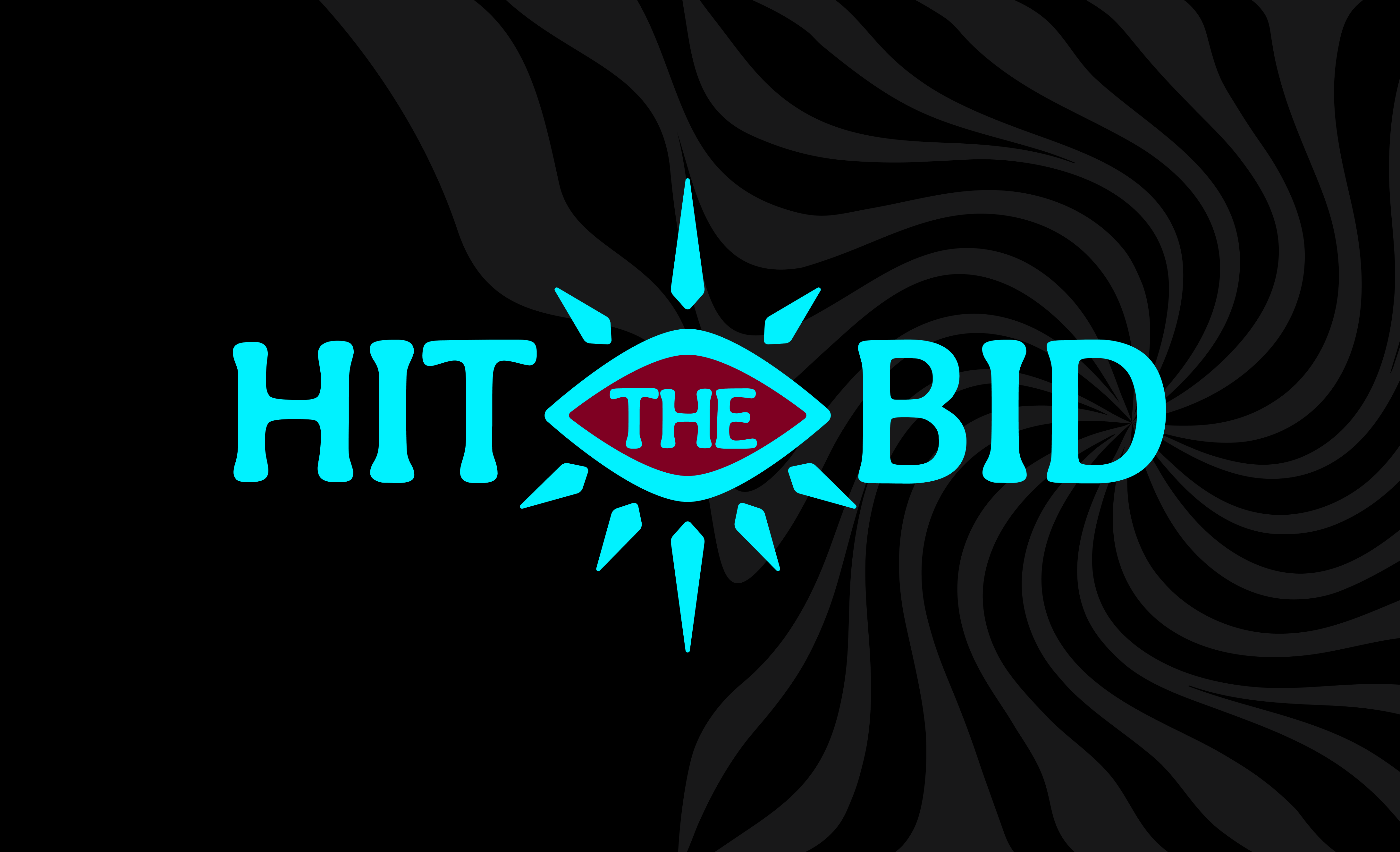
Developing the visual direction for different products was a collaborative process, with concepts evolving through rounds of client feedback. Here are a few of the brands I had a hand in, whether contributing to the concept, creating the established mark, or building out its supporting visual system. Only a selection of this work is featured here, but feel free to reach out if you'd like to learn more about my contributions!







Expanding the System
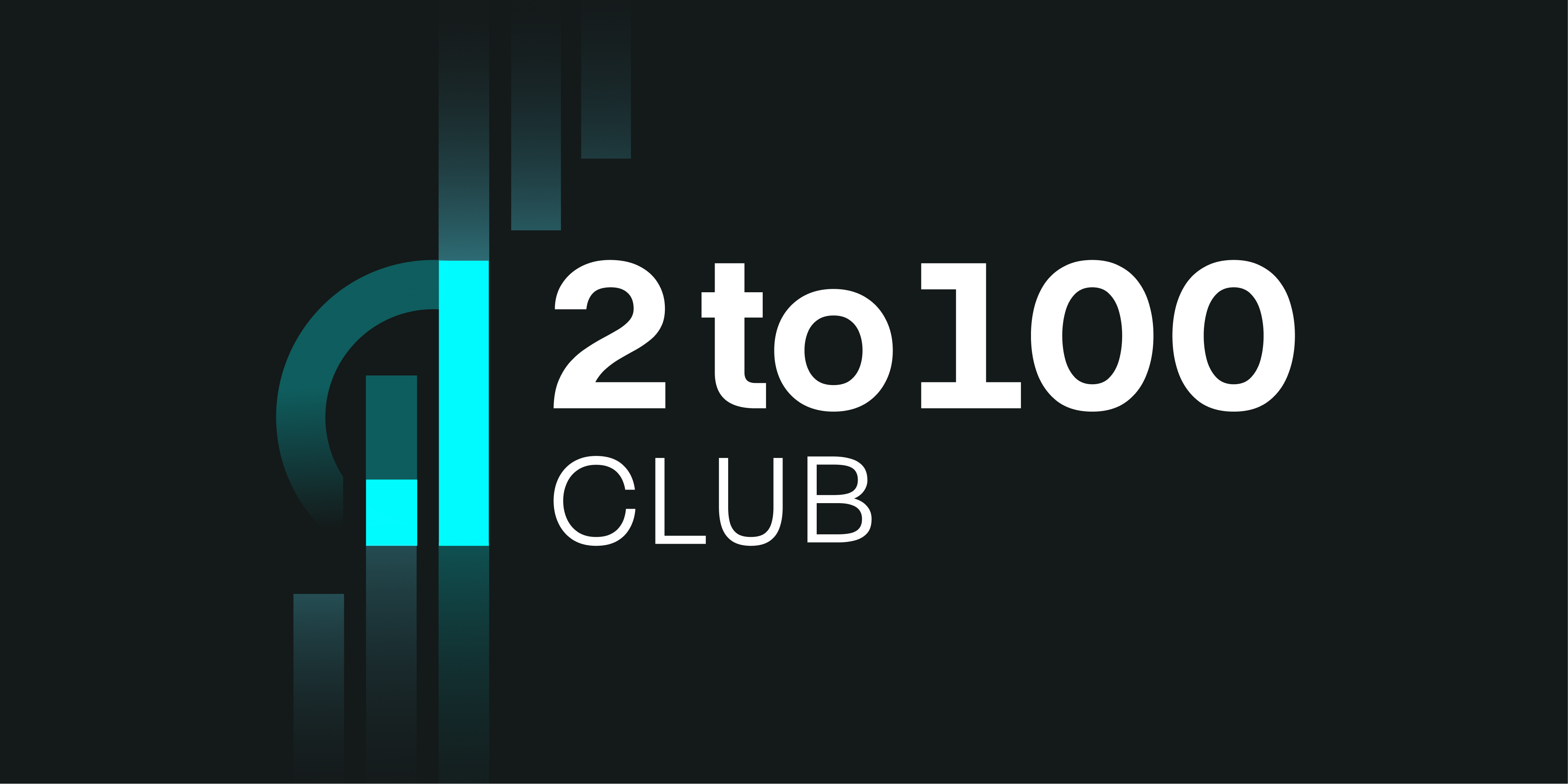
Each brand brought different goals while refining the final identity, with opportunity for standalone marks to full systems that extend the parent identity. Products with multiple offerings under their umbrella often required their own sub-identities and visual language that could be extended while maintaining a connection to the parent as a whole.





Beyond the Logo
A logo is only the starting point. Each brand needed a flexible visual identity that could extend beyond its initial design while remaining recognizable and distinct. The focus was on creating a cohesive brand experience and maintaining consistency throughout each digital application.
Presentation decks
Branded presentation templates designed to support business goals and maintain visual consistency across professional communications.
Brand guides and assets
Defined guidelines shaping logo usage, typography, color palettes, and visual assets to establish a cohesive identity and guide future design applications.
Website application
Applied brand identities to web interfaces and page layouts, emphasizing visual hierarchy, readability, and accessible design.
Social share graphics
Branded graphics created for website content and digital sharing, reinforcing each brand’s visual identity and recognition.
Email headers
Custom email headers designed for newsletters and service communications, creating a recognizable and polished brand presence in every message.
Promotional graphics
Product mockups and key screen designs created to showcase features, highlight offerings, and promote products throughout the company’s portfolio.
Adapting for Growth
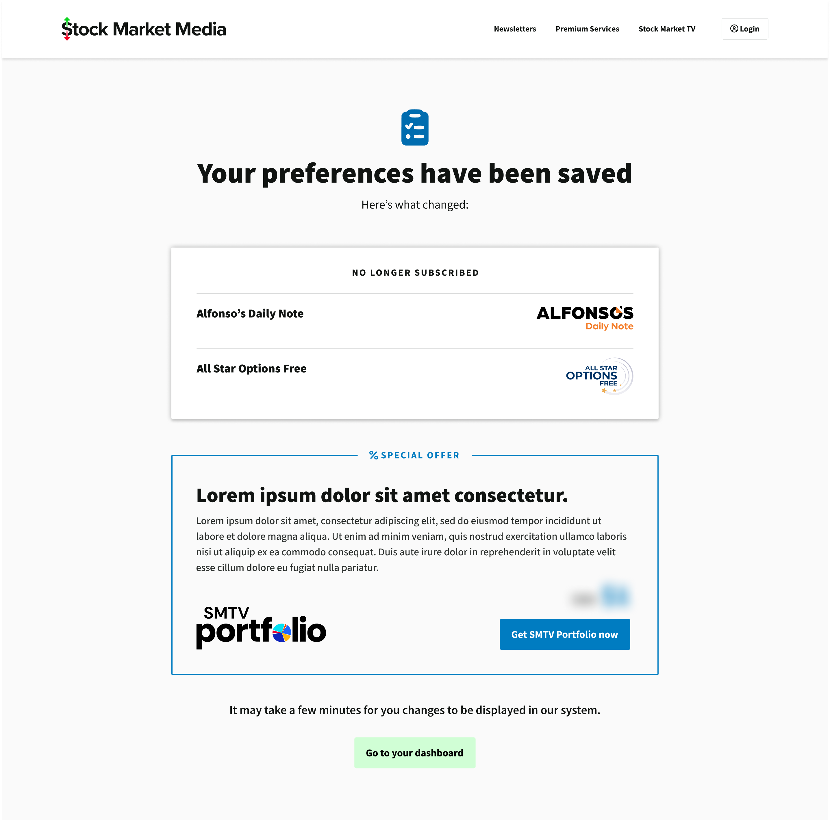
As new newsletters and products were introduced, I helped adapt the existing dashboard and other page types to accommodate the additional content and features. This included collaborating on new page flows, redesigning Drupal content types, and improving field organization to make information easier to manage to enhance the overall user experience.
Supporting New Initiatives
Building out marketing landing pages and designing for special offers and promotions was another ongoing part of expanding the network’s digital presence. This included establishing clearer information hierarchies in various layouts to improve usability, while also creating new designs to support evolving business needs.
Where Design Meets Development
Working across a variety of brands within this network gave me the opportunity to contribute beyond their initial visual identities and into their digital applications. From contributing to both design and development aspects, I gained valuable experience connecting the creative and technical sides of design. This helped me better understand the process from initial design decisions to how they're developed and implemented, therefore strengthening my ability to make more informed decisions from the start. Explore more of the sub-sites I worked with the team on below!